

Poly Prep “Summer Camp Redesign”
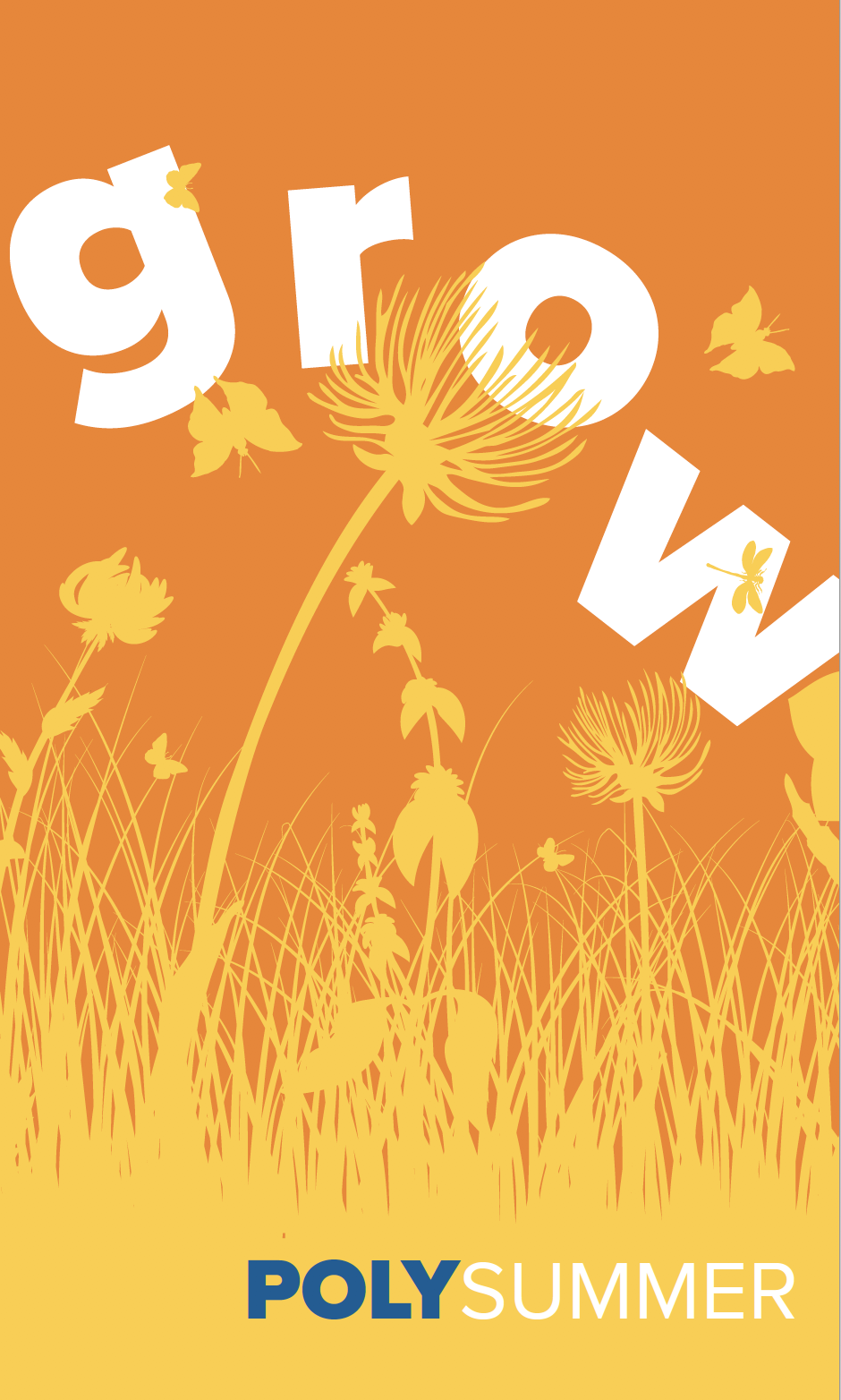
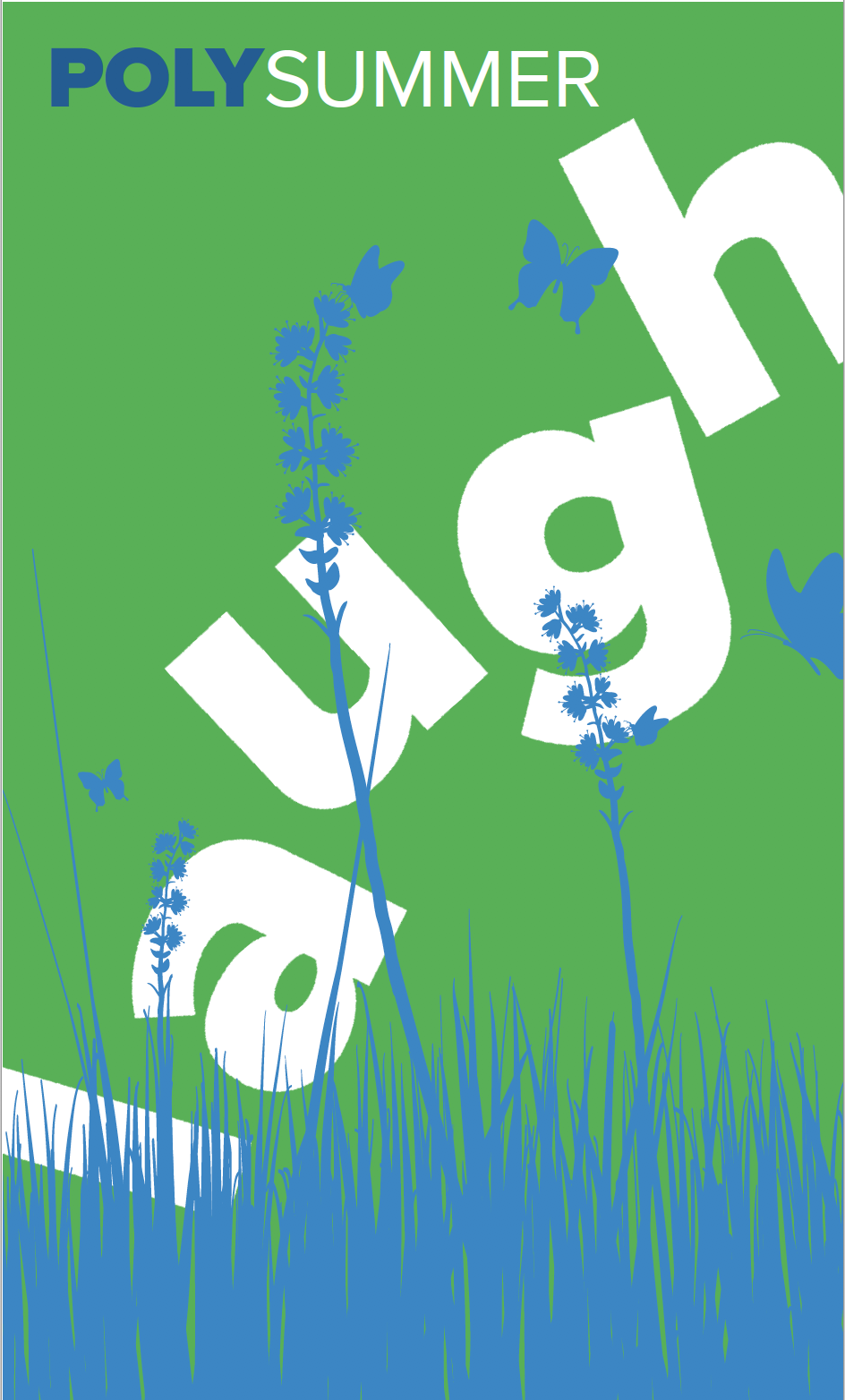
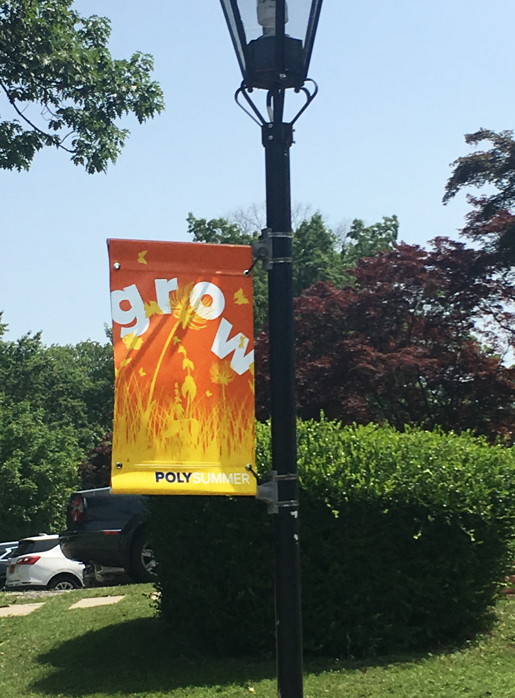
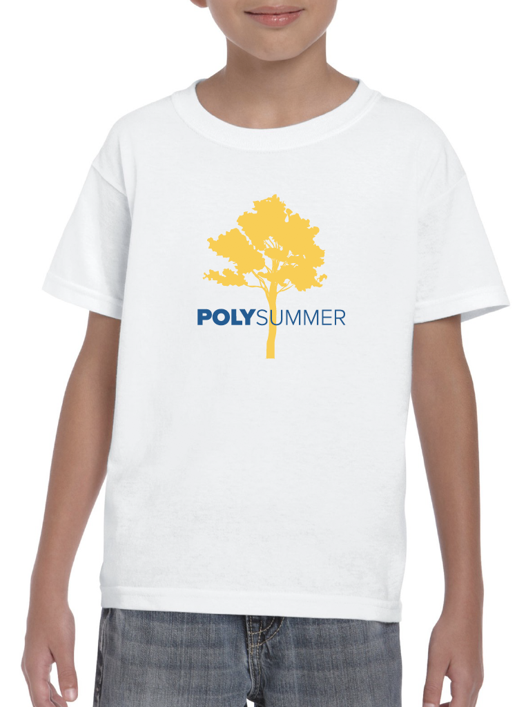
25 acres in Brooklyn NY make for a beautiful location for a summer camp. The problem was most people didn’t know it existed. A hodgepodge of materials, lack of cohesive theme, and being hidden within the larger school made it difficult to enroll new families. Using the new design system we made it more playful and appropriate for summer fun as well as a younger audience. Suddenly from the moment you arrive on campus, you felt the warmth of the camp as much as the sun.
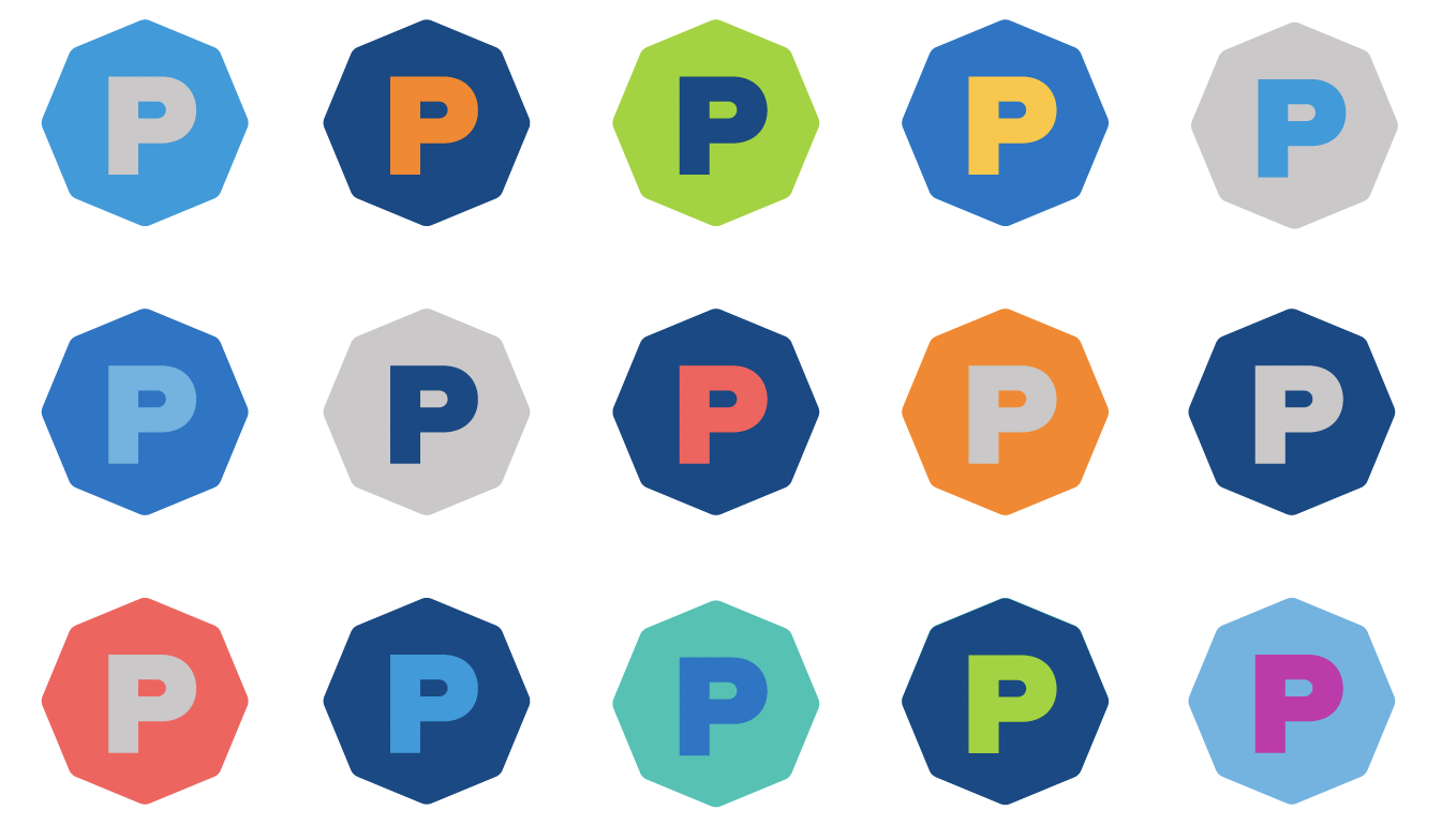
The Good Stuff: signage, apparel, website, iconography

“Their flexible system continues to deliver just as promised. We have a rich body of work that remains fresh and can be built on in endless ways. I still get compliments on our visual identity with every new asset we create.”
— Jennifer Slomack, Director of Engagement and Communications


see more Fancy work:
Poly Prep "Brand Repositioning & Redesign"
ModMouth

mē