Poly Prep Country Day School “Brand Positioning and Redesign”
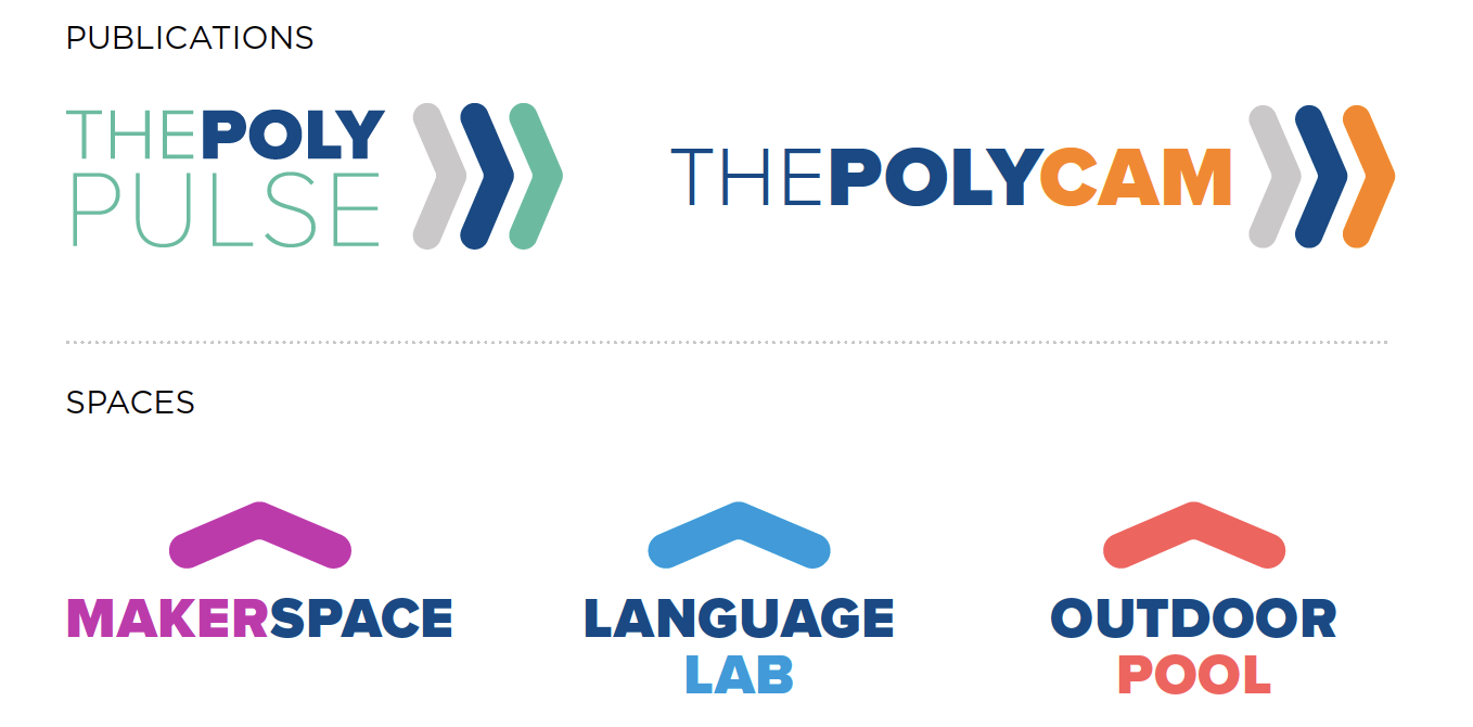
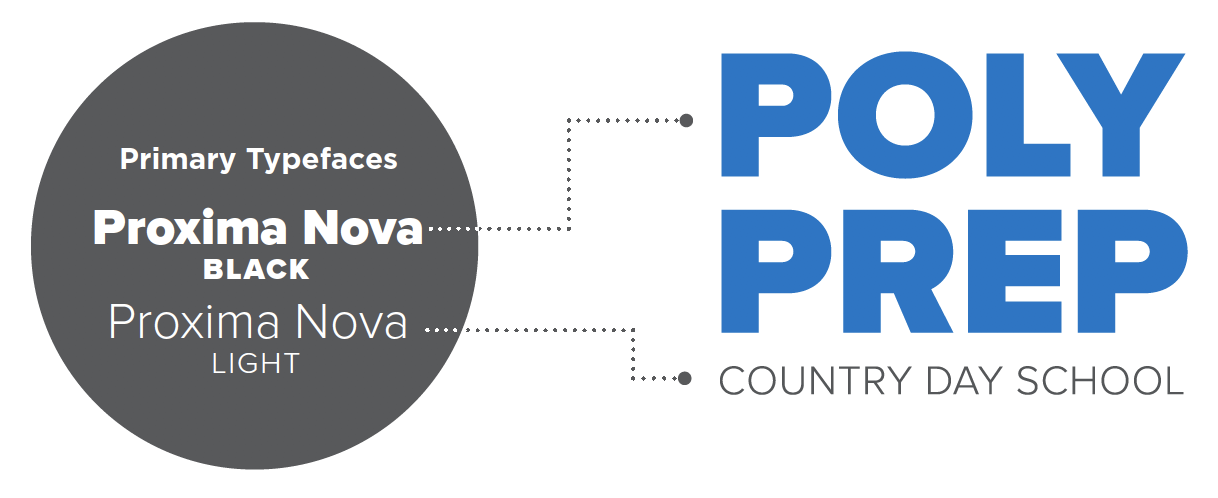
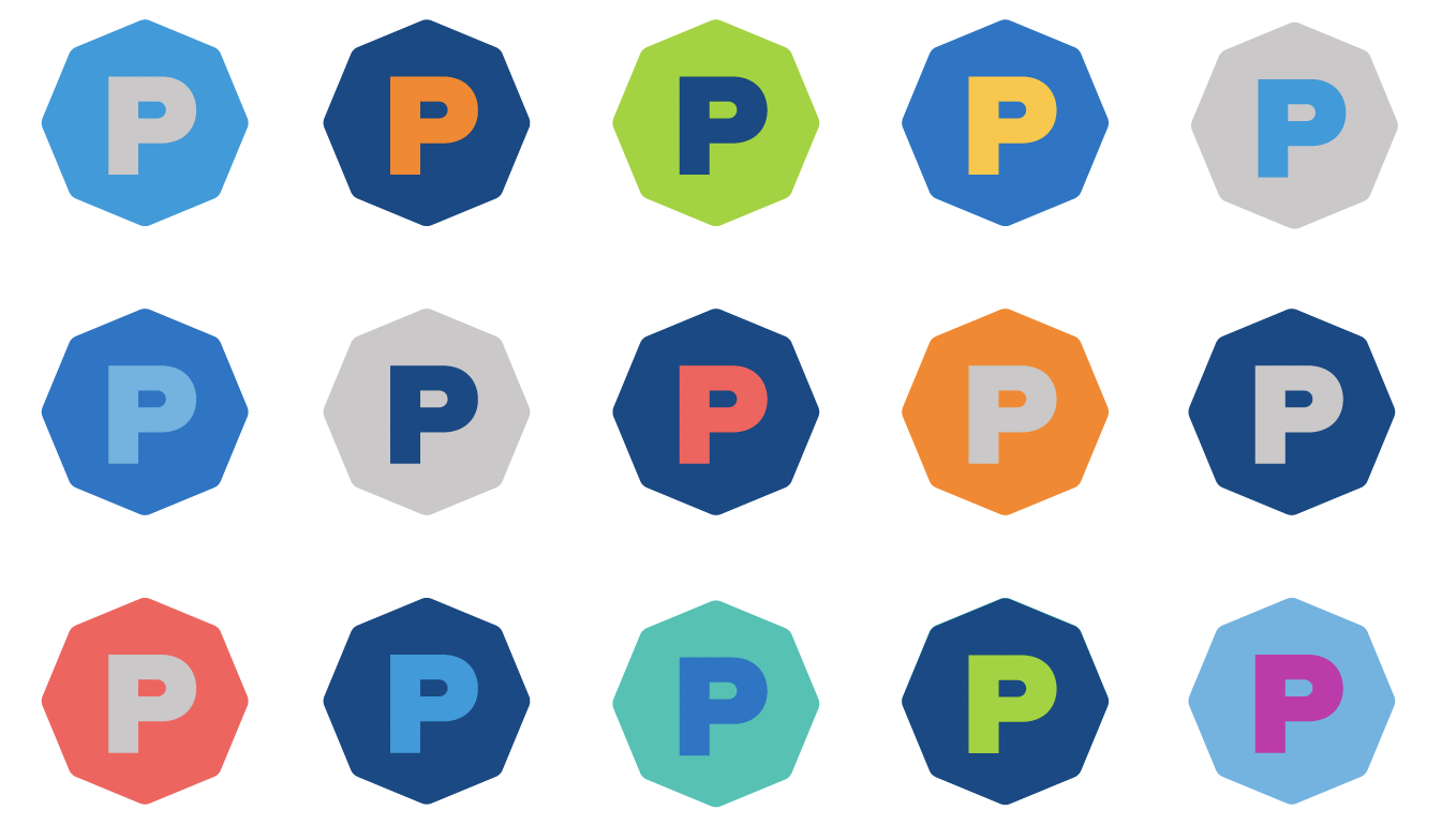
This 150 year old institution is steeped in tradition with a wide variety of stakeholders including students, parents, faculty, staff, alumni, and trustees. A reputation as a sports-focused old boy’s club, an inconsistent visual identity and a lack of clear strategic positioning was keeping the school from the top of the consideration set of families looking for an independent school in NYC. We helped Poly lean into holistic diversity and used that as inspiration for a unified design theme. Joy and community was brought into the logo, color palette, and coordinated elements that allied messaging to at once unified, as well as distinct between departments. This new design system was implemented across all touch points at the school.
The Good Stuff: strategic positioning, logo, color scheme, design system, tone of voice, manifesto, stationery, magazines, admissions & advancement materials


“Fancy skillfully created a brand identity, positioning, and visual design system that allows us to speak to our diverse audiences with ease and confidence. It fuels everything we do big and small. It is the envy of my peers!”
– Jennifer Slomack, Director of Engagement and Communications
